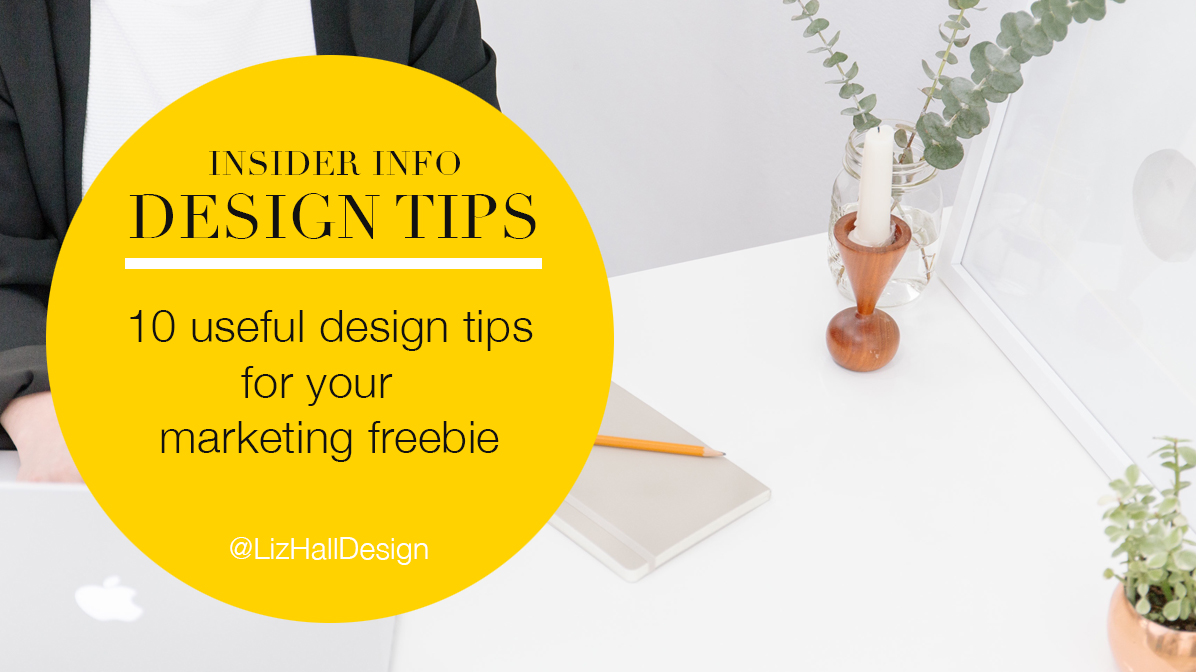
A marketing freebie is a great asset for your business – you can tempt people to sign up to your email list, use it as a Thank You to your customers, or simply to show your expertise and have as a download on your website or on your social media.
So how do you start? Well, I can give you a few tips from the design side but unfortunately, coming up with the content is your first job!

Large font family
Pick two fonts at most and a little design tip is to pick a font with a large family. So a font that has different versions, light, medium, regular, bold. This gives you more options but it means that your freebie won’t look messy with lots of different fonts and styles.

Different sizes of text
Use different sizes of text to make your information more or less important.
Big titles to attract attention, smaller text for the paragraphs. As it’s meant to be read online, use a larger spacing than usual between the lines on your paragraphs so it’s easier to read.
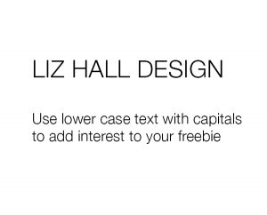
Mix up lower case and capitals
Mixing up lower case and upper case text can add interest – you can use capitals for titles or quotes or tips.
Paragraphs usually work better as lower case as it’s easier to read. However, I often highlight the first paragraph using capitals if it’s fairly short. Just remember to increase the spacing to make it easy to read.
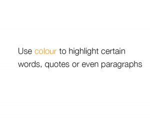
Use coloured text
Adding a colour to your text can make it stand out or add interest even if it’s all the same size. Use it to highlight a word or sentence or even the first paragraph.
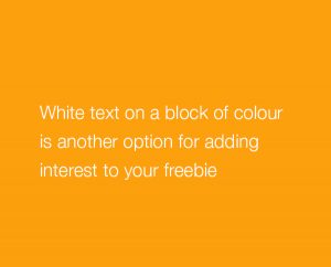
White text on blocks of colour
White text on a block of colour is another option for adding interest – it can look good for titles, quotes, any thing that needs extra attention.
Text over an image
If you have a suitable image, you can add text over the top or over part of it. Just don’t over do it as it can look messy or difficult to read.
Use images
Use images to illustrate your point whether photos, vector illustrations or charts. Try to use no more than one per page. But if you have a number of images you need to show, align them so your eye follows them easily.
Use two colours
Try stick to two colours or three at the most, ideally from your logo. Too much colour can distract the eye and in this case, you want people to read your information.
Don’t be afraid of white space
Most importantly, don’t be afraid of white space! You don’t have to cram your pages full of text, colour and imagery. Your information needs to be easy to read or people will just give up and not bother.
It’s an online freebie so you’re not tied to print costs – spread your information over as many pages as you need. If you have lots of tips, use one or two per page.
Make your pages consistent
Create a template and make all your pages look consistent, especially if you’re sharing lots of tips. People may scroll through quickly and it helps when everything is the same on every page so they can find what they’re looking for quickly and easily.
And finally
Don’t be tempted to use every idea on the list as your customers won’t know where to focus or know what the important information is.
Freebies need to be clear and easy to read, and easy to refer back to.
I’d love to hear how you get on – let me know in the comments.
Liz x